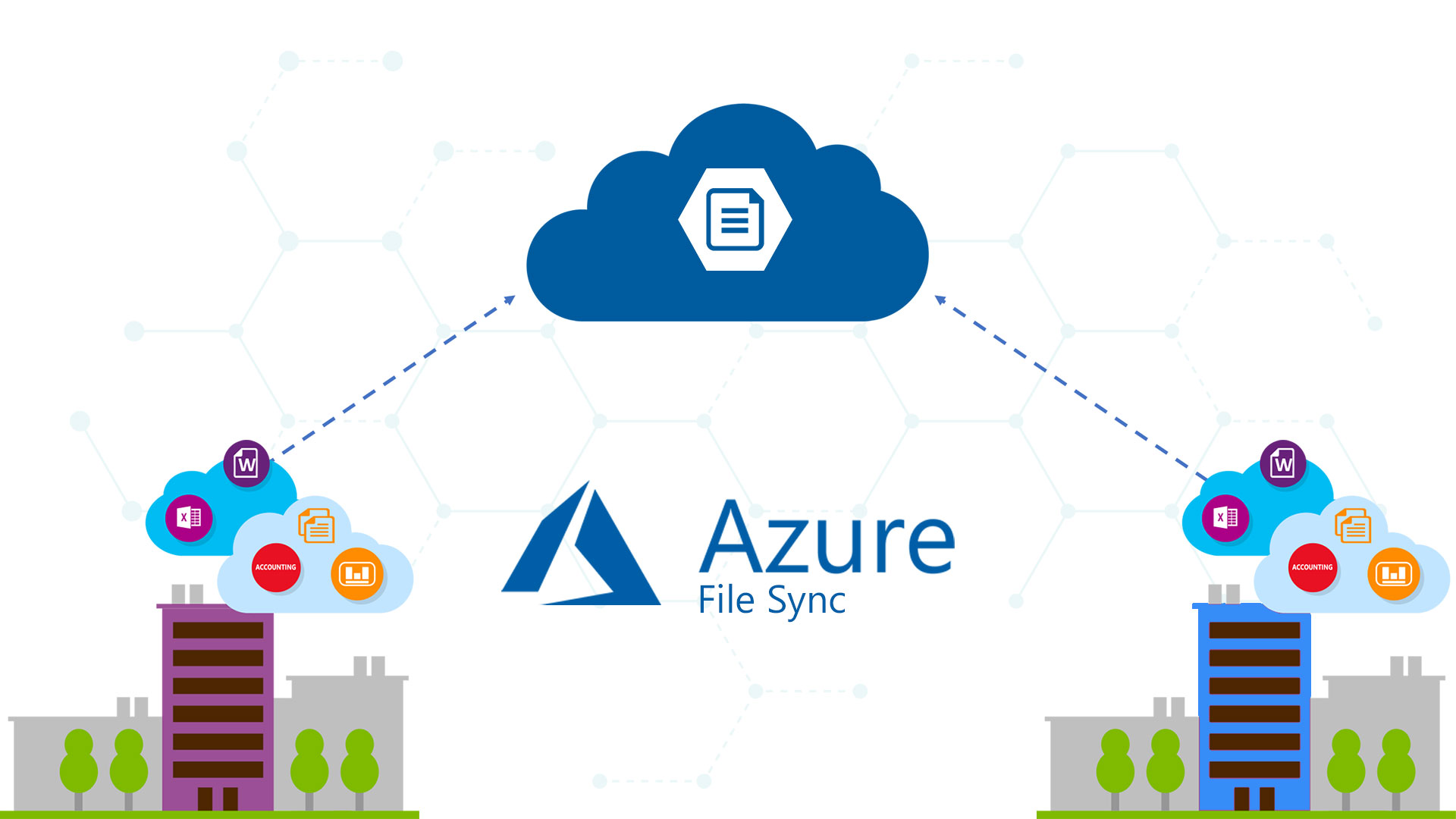
In my previous article I had introduced Azure File Sync, a service that gives you a fully managed cloud file share and extends the ability of organizations to share files across on-premises and the cloud.
The service works fine but it will be nice to have a Graphical User Interface to monitor its health status, data synchronization, activity logs, etc. Thanks to Azure Monitor we can build charts with specific metrics about AFS.
In this quick article, I will show you how to create a custom dashboard for Azure File Sync and aggregate all the important metrics and activity logs into a single view.
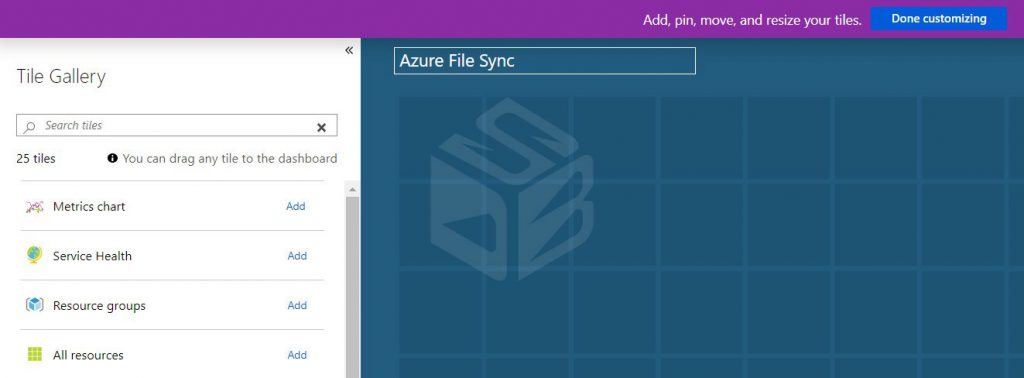
The first point is creating a new dashboard dedicated to AFS – figure 1.
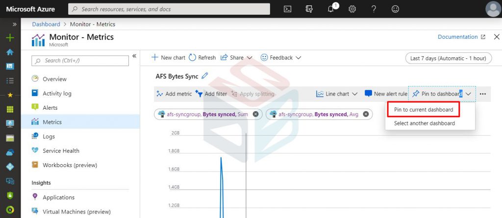
Open Azure Monitor and add new metric for your Azure File Sync Group, select the metric namespace, the metric name and the aggregation. Save the metric into the “Current Dashboard” – figure 2.
Repeat the task for each of these objects:
Storage Sync Service
- Monitor Name: AFS Bytes Sync – Namespace: Storage Sync Service – Metric: Bytes Synced – Aggregation: Sum e Avg
- Monitor Name: Cloud Tiering Recall – Namespace: Storage Sync Service – Metric: Cloud Tiering Recall – Aggregation: Sum
- Monitor Name: AFS File Sync – Namespace: Storage Sync Service – Metric: File Synced – Aggregation: Count, Avg, Sum
- Monitor Name: Server Status – Namespace: Storage Sync Service – Metric: Server Online Status – Aggregation: Max
Storage Account
- Monitor Name: Storage Egress – Namespace: Account – Metric: Egress – Aggregation: Sum
- Monitor Name: Storage Ingress – Namespace: Account – Metric: Ingress – Aggregation: Sum
- Monitor Name: Storage Transaction – Namespace: Account – Metric: Transaction – Aggregation: Sum
- Monitor Name: Storage File Count – Namespace: File – Metric: File Count – Aggregation: Avg
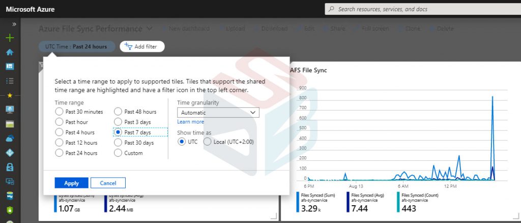
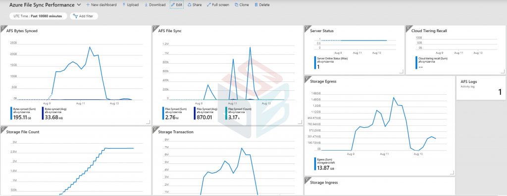
When all the metrics are added, you can customize the dashboard as you want. Now you are ready to see the objects with the right time range – figure 3.
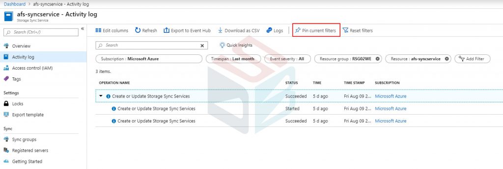
You could also add the activity logs but unless you have frequently operations, this area will be always empty. By the way, you can add the default view into the dashboard with button Pin Current Filters – figure 4.
At the end of all, the result will be similar like figure 5.
Summary
In few minutes we have a full picture of our Azure File Sync infrastructure to predict and prevent potential issues. If you have Enterprise Agreement, or Pay-per-Use, subscription you can add also a tile with the cost of service.
#DBS